

client custom merch sourcing identity, web + print
brief
merchit! sources custom merch for camps, offices, orgs and events. the brand had to be playful enough for a summer camp and credible enough for an office order.
logo
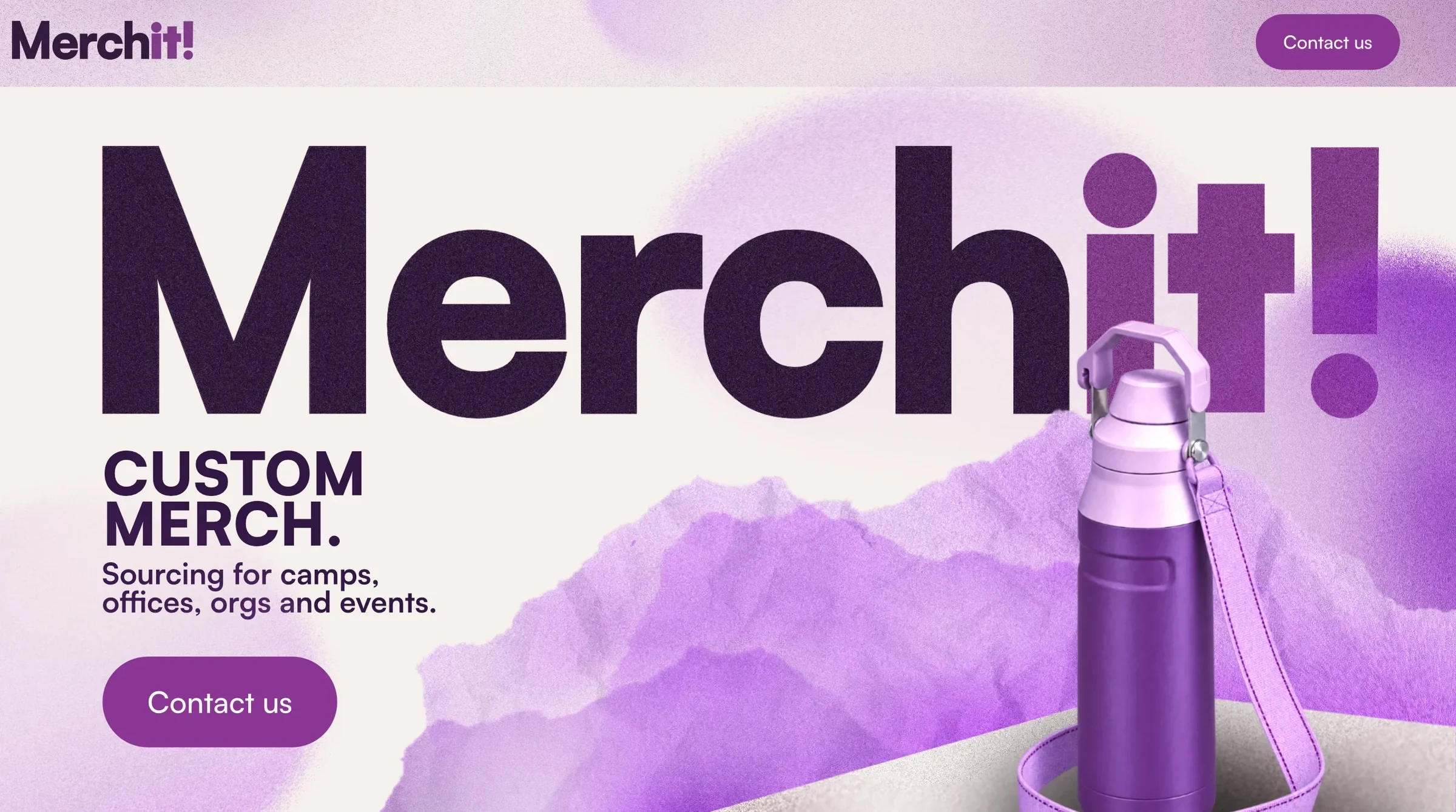
"merch" sits in the dark purple so the name reads at a glance. "it!" switches to the accent color and a heavier weight, so the exclamation carries the energy. where the full name won't fit, an M! monogram takes over: favicons, social profiles, patches.


color
cool purples on a warm off-white, so the palette stays fun without turning cold or candy.
- primary dark#3c1d49 · text, "merch"
- primary light#deb8e0 · backgrounds
- accent#9a47a3 · "it!", buttons
- neutral base#f5f3f0 · the canvas
type
satoshi throughout: black for headlines and the wordmark, bold for headers, medium for body copy.
website
a homepage design built around the wordmark at full width, with the product breaking through it. one message, one button: contact us.
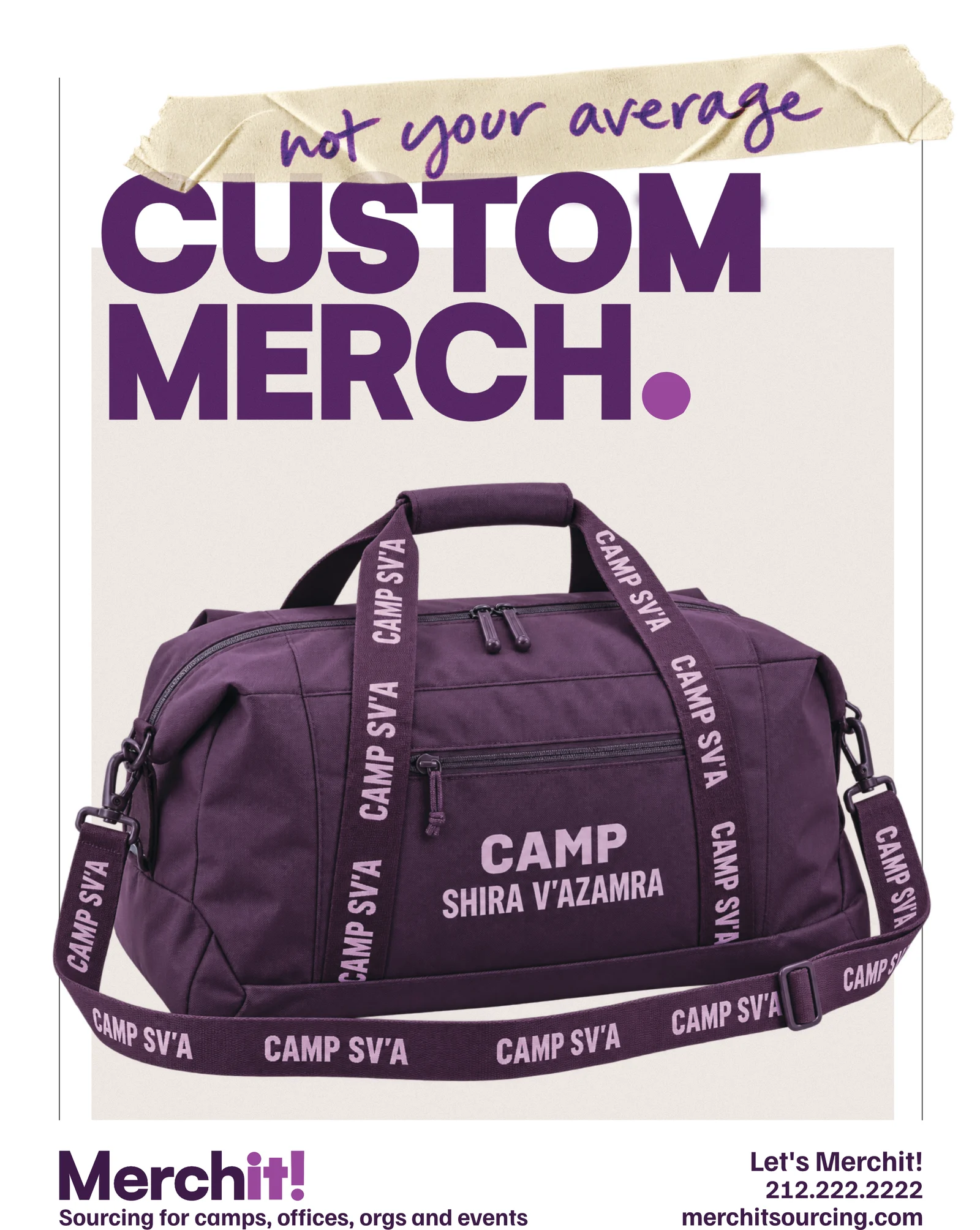
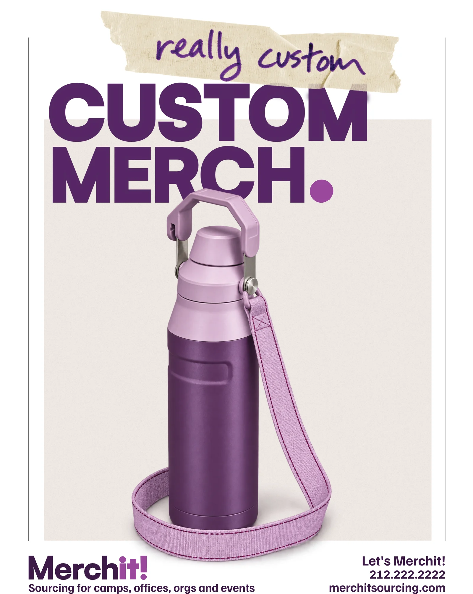
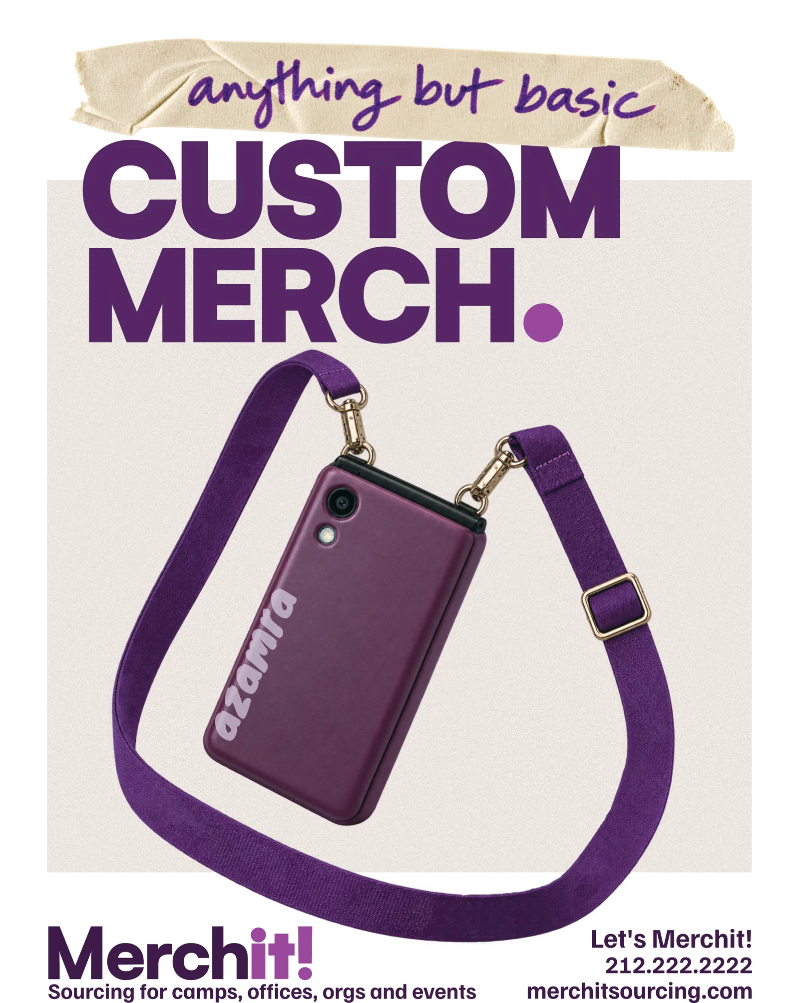
a flyer series with one fixed layout: CUSTOM MERCH. across the top, a handwritten line on tape above it, a real product for a real client in the middle.
what we made
logo, monogram, color and type system, brand guidelines, homepage design and a flyer series.