

project concept burger brand identity + packaging
brief
a burger and sandwich brand that says what it sells in one look.
logo
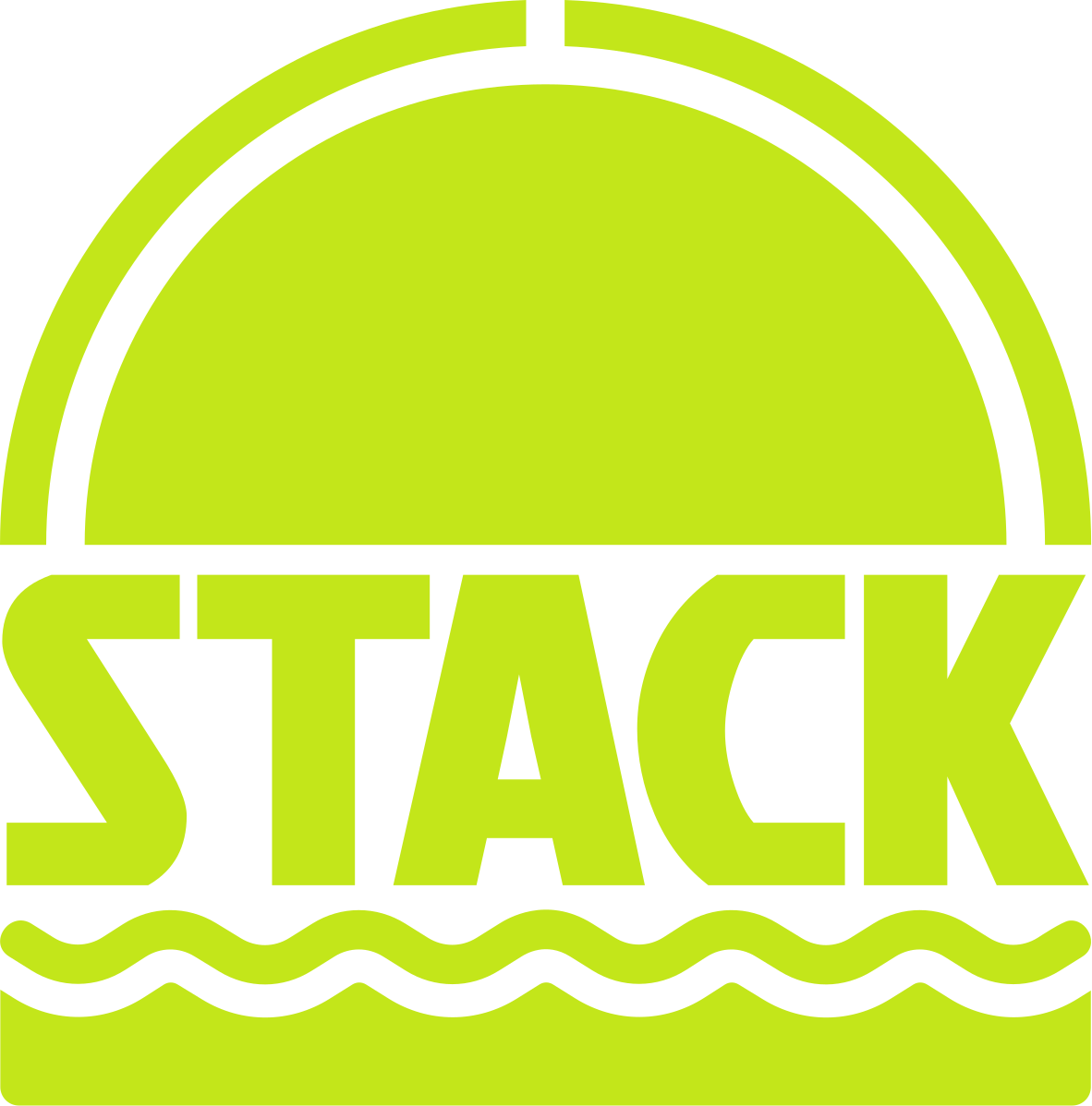
the logo is a burger built from the name. the dome is the top bun, STACK is the patty, the wave is the lettuce and the base is the bottom bun. on wide surfaces the wordmark and the wave run on their own.
color
lime on charcoal. two colors, used everywhere.
- lime#c3e61a · the mark, bands, lids
- charcoal#2f2e2d · packaging, type
type
jockey one throughout. condensed and heavy, so STACK reads from across the counter and still fits on a fry carton.
packaging
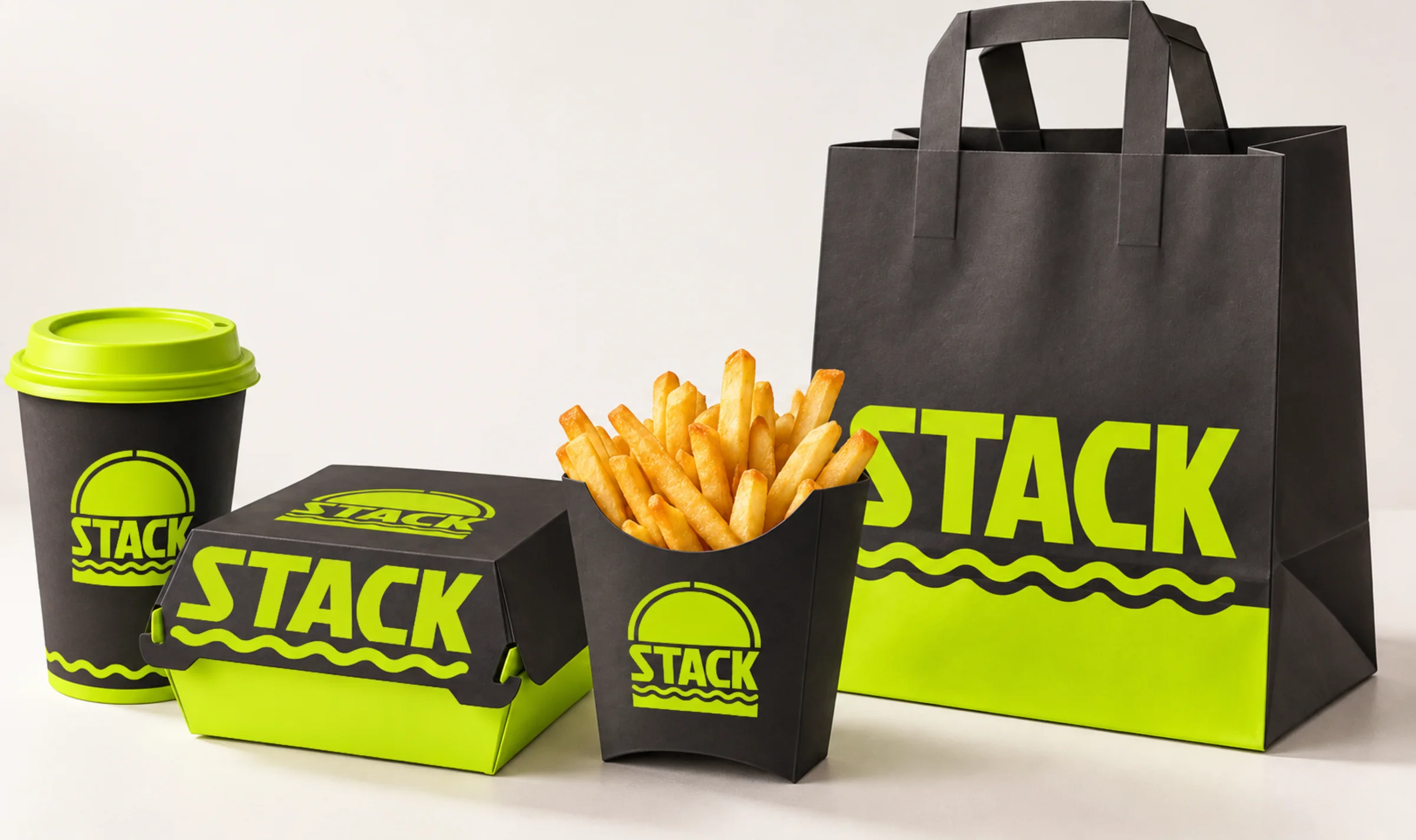
charcoal stock with lime print. the wave runs along the bottom of the cup and bag, the mark goes where there is room and the wordmark where there is width.
what we made
logo, wordmark, color system and packaging for the cup, burger box, fry carton and takeaway bag.